Welcome. Today I have a few cards to share using the June Card Kit from Simon Say Stamp…
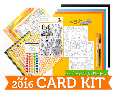 |
| More details of the kit can be found HERE |
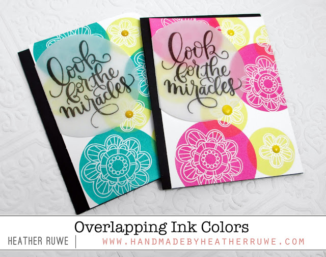
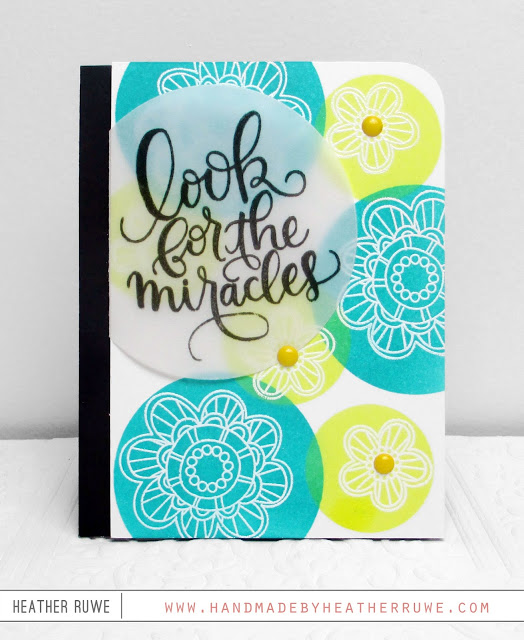
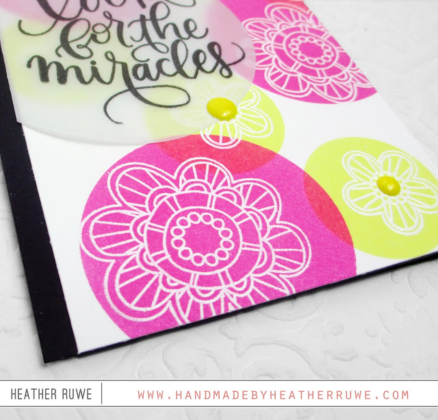
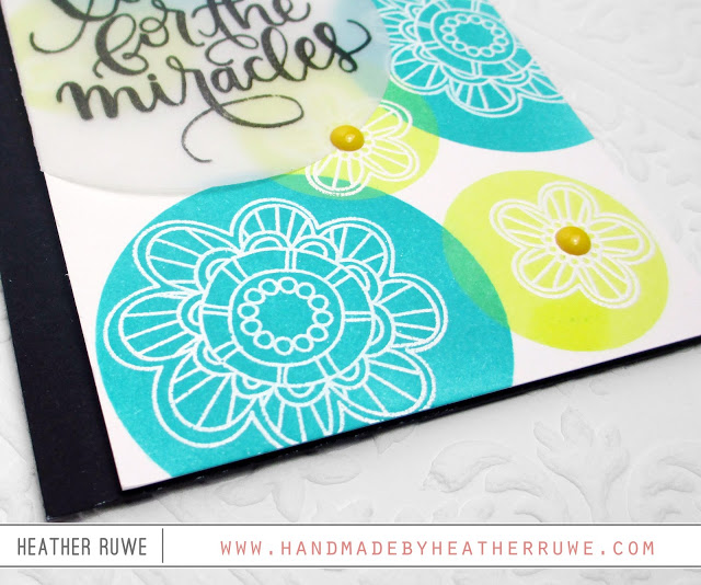
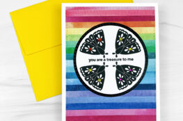
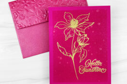
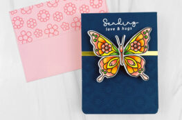
It’s called, “Look for the Miracles” and I really like the bright colors. I made two cards using an embossed resist technique and overlapping ink colors…
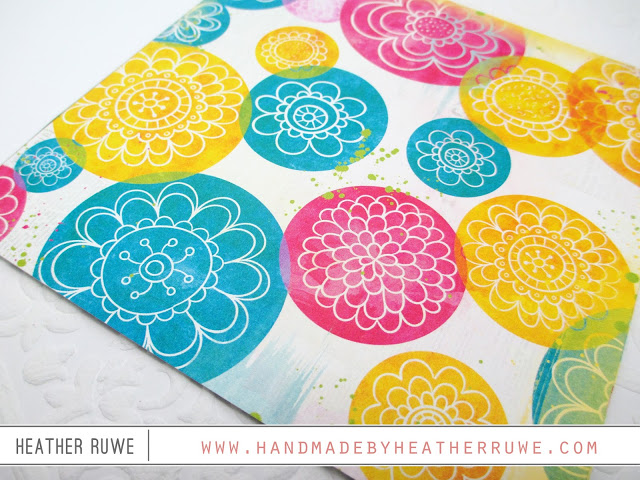
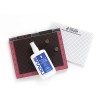
Before I get to the cards, I want to share where I got my inspiration. I loved this sheet of patterned paper in the kit and used it as a jumping off point to get started….
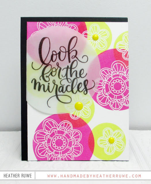
To create the cards, I stamped the flower images in the stamp set using VersaMark ink on to a piece of white cardstock in the kit. Then I heat embossed them using THIS embossing powder. I created two different sized circle mask using THIS masking paper and THESE dies. I picked circles that were slightly bigger than the flowers. I applied different colors of distress ink (since they blend so well) with THIS blending tool and layered the color on top of each other. Where the two colors meet, a new color is created!
For this card…









May 18, 2016
Super pretty cards Heather. I love the look of them both, they are so bright and summery. If I had to pick a favourite (this is hard), I would go with pink and yellow. But I do love the peacock feathers and yellow too – great combination. I see that you only have one enamel dot holding the vellum, so I am presuming you managed to hid a little behind the letters too? Looks wonderful, great inspiration too. Thank you.
May 18, 2016
I love the one with the Peacock Feathers color! Aqua is a favorite color of mine, so I have to go with that! They are both great combos though!
May 17, 2016
Love the blue and yellow card.